Aisle or Room? Where Health & Beauty Earns More in a Supermarket
Health and beauty is usually drawn as an aisle. Two runs of standard shelving in the ambient middle of the store, a bay count, and the range arranged roughly the way the suppliers deliver it. It is the same treatment the tinned goods get — and that is the problem, because health and beauty does not sell the way tinned goods sell. It is a browse-and-consider category. The shopper who trades up from a cheap moisturiser to a premium one is a shopper who stopped, read two labels and compared them. Give that shopper a defined, well-lit space to do it in and the category grows. Give them a corridor with trolleys coming through it and they take the thing they came for and move on.
Health and beauty does not reward a fast walk-past
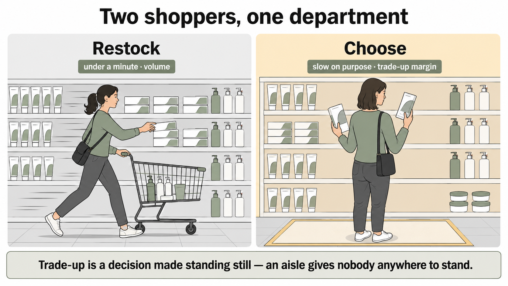
Two very different shoppers use this department — one restocking in under a minute, one choosing slowly. The margin sits with the second, and an aisle with trolleys coming through it gives them nowhere to stand.
Two very different shoppers use this department. One is restocking — a known toothpaste, the usual shampoo, nappies. That shopper wants speed, clear navigation and reliable availability, and is finished in under a minute. The other is choosing: a foundation shade, a serum, a supplement, a fragrance as a gift. That shopper is slow on purpose. They pick things up, turn them over, read the back, put them down and pick up the next one.
The whole margin story sits with the second shopper. Everyday toiletries are the volume and the routine; cosmetics, premium beauty, fragrance and wellness are the trade-up and the growth. Trade-up is a decision made standing still. So the layout question is not really "how many bays does health and beauty get" — it is "does this department give a shopper anywhere to stand and think." An aisle does not. A defined space does.
What "a room" actually means here
It does not mean walls, and it does not mean a beauty hall. In a supermarket it means the shopper can tell they have arrived somewhere different from the aisle they were just in.
That reads through a handful of cheap signals: a clear edge or entry rather than the department bleeding into groceries; runs turned or set back so the space has a bit of depth instead of being a straight through-route; a bulkhead, a ceiling change or simply a different light over the top of it; and its own signage tone. In a small store it might be one bounded end-of-aisle bay with better light. In a large one it might be a proper set-apart area with a feature and an advice point. The point is not the capex — it is legibility. A shopper who knows they have walked into the health and beauty department shops it differently from one who is walking down an aisle that happens to have shampoo on it.
That is the same move that works for wine, and for baby: departments a shopper considers earn more set apart than strung out along a gondola run.
Navigate by need, not by supplier
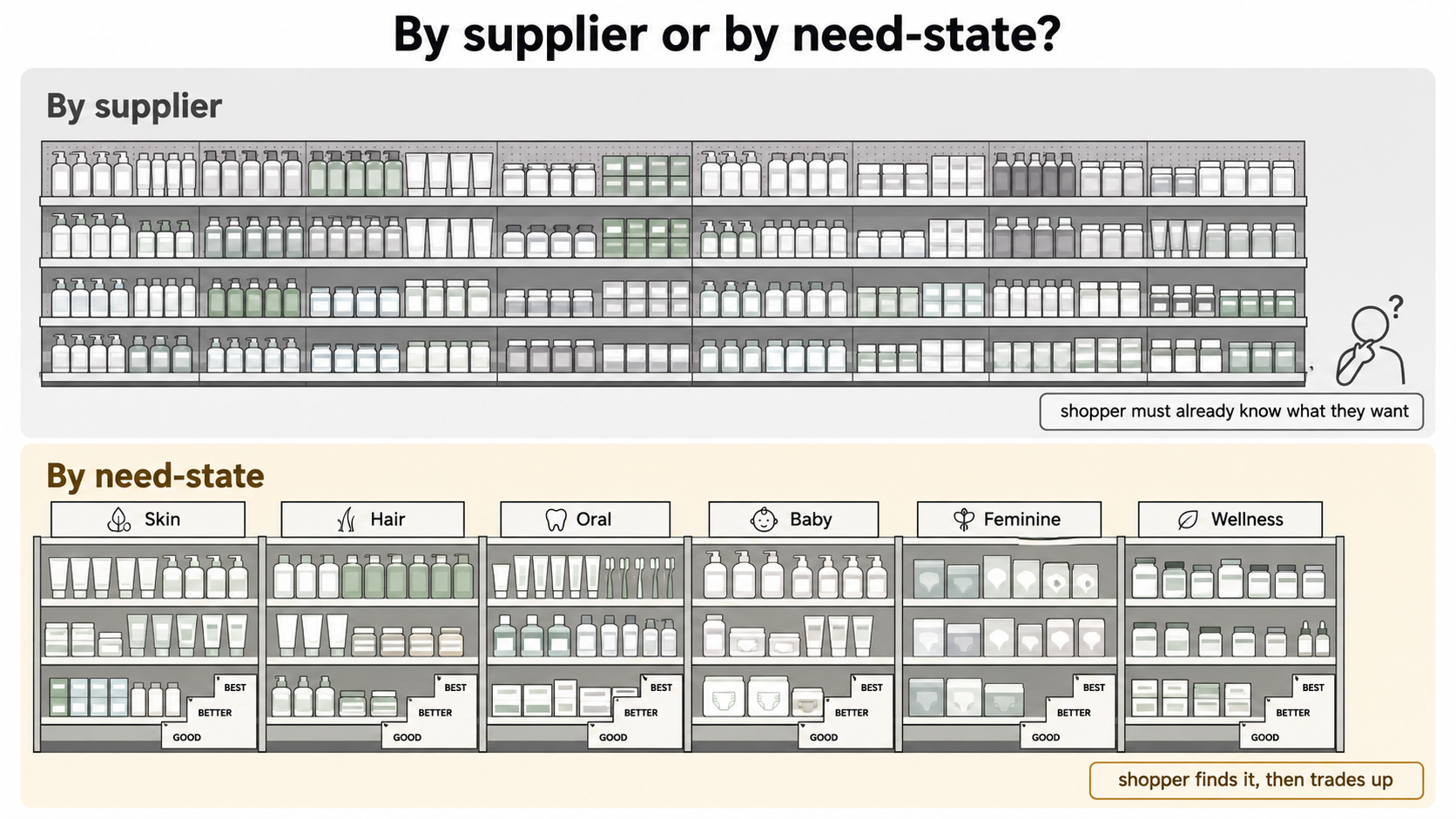
Arranged the way suppliers deliver it, only a shopper who already knows what they want can find anything. Navigated by need — skin, hair, oral, baby, feminine, wellness — the shopper finds it and can then trade up within it.
The single most common failure in this department is a wall of product a shopper has to decode. Health and beauty is a genuinely confusing range — it is where a store carries the most brands, the most near-identical packaging and the widest price spread on the floor. Arrange it the way it arrives from suppliers and the shopper has to already know what they want in order to find it, which quietly cuts the department down to its restock trade.
Navigate it by need-state instead: skin, hair, oral, baby, feminine, wellness. That is how the shopper thinks — "something for dry skin", not "brand X". Inside each need-state, block good, better and best so the trade-up is a step across rather than a hunt. Sign the need-states at eye level so they can be read from the entry to the space, and keep the price and unit ticket flawless before adding any cleverer signage layer.
The wellness lines make this sharper still. Supplements, vitamins and free-from products are the range shoppers understand least and most want help with. Left as an unsigned block they intimidate; navigated clearly, and given an advice point where the store role justifies one, they become a trust and trade-up department rather than a shelf of jars.
Light it colour-true, or don't bother stocking the premium range
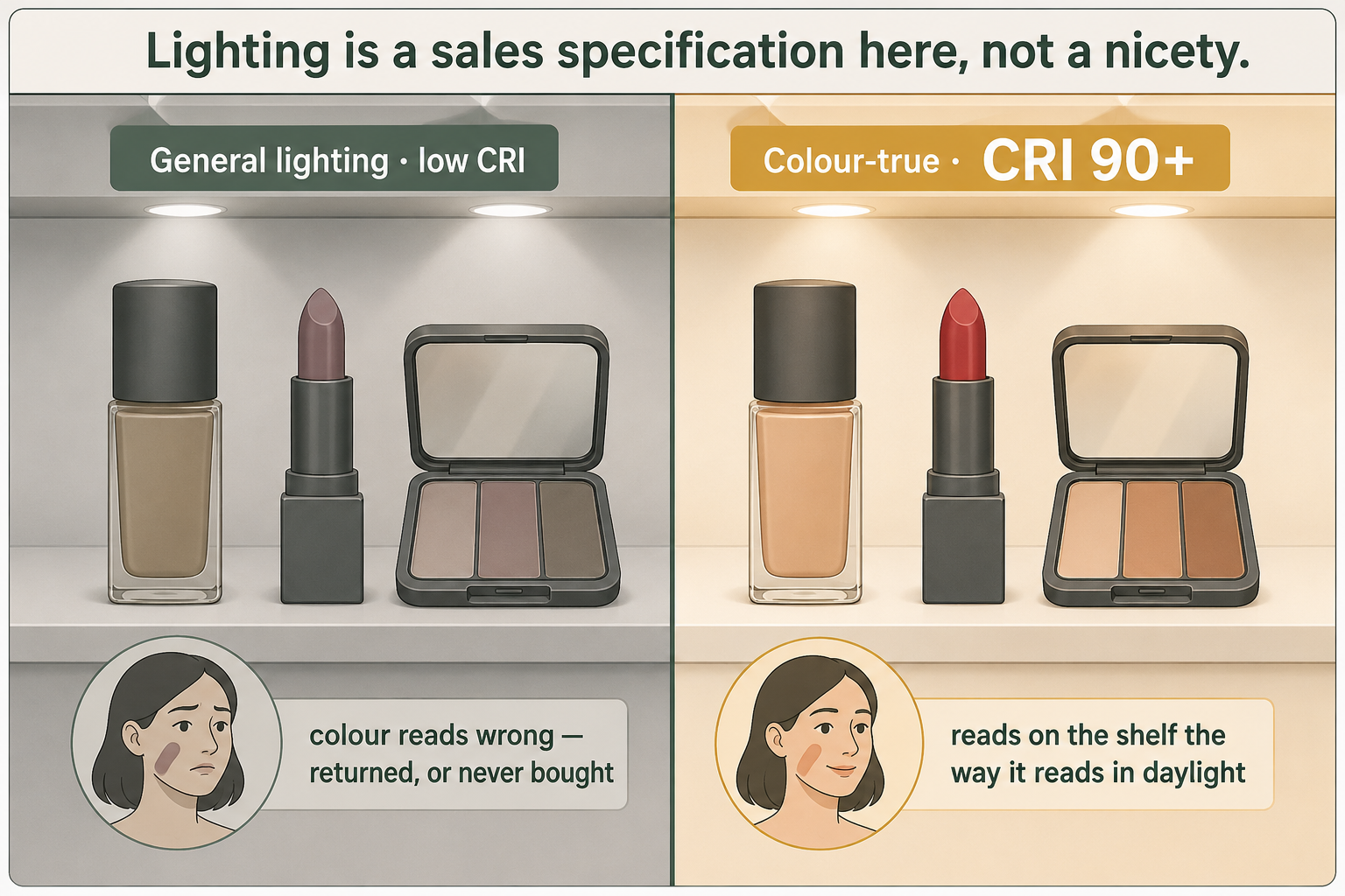
Cosmetics need a CRI of 90 or above so a colour reads on the shelf the way it will read in daylight. Under general lighting the shopper either buys the wrong shade and returns it, or senses something is off and does not buy at all.
This is the specification most stores get wrong, and it costs real sales.
Cosmetics have to be lit with high colour-rendering light — a CRI of 90 or above — so a colour reads on the shelf the way it will read on the shopper's face in daylight. Under general warehouse-grade lighting, foundations, lipsticks and hair colours read wrong. The shopper either buys the wrong shade and returns it, or senses something is off and does not buy at all. Neither shows up in a report as a lighting problem; it shows up as a category that will not grow.
The rest of the department needs clean, even, navigable light so the need-state signage and the pack copy are easy to read — a lot of this range carries small print, and a shopper who has to squint at an ingredient list will put it back. Where there is a beauty feature, light it to flatter and let it lift the perceived quality of everything around it. Lighting is one of the two levers that changes how a store feels without moving a wall, and this is the department where it converts most directly into basket value.
Secure the handful of lines that carry the theft
Health and beauty has a shrink profile unlike anything else in the ambient store: the losses concentrate in a very small number of lines. Fragrance, small electricals, razors and premium cosmetics carry almost all of it. They are small, valuable and easy to pocket.
The bounded-space move helps here, because a defined department is far easier to keep in one staff sightline than two long runs in the middle of the floor. Put the high-value lines where the department is naturally overlooked — from a service point, a manager position or a till line — rather than in the deepest, quietest corner. Where the store role justifies it, use secured or staff-assist display for those lines specifically, and leave the rest of the department open, because locking up the whole category kills the browsing the department depends on. Cover receiving too: high-value stock is at its most exposed between the delivery door and the shelf.
The second half of the shrink is dates. Cosmetics and sunscreen expire, and sunscreen in particular is seasonal, so it dates out quietly if nothing rotates it. Run first-in-first-out on the dated lines, keep the storeroom close enough that refilling properly is quicker than dumping new stock on top of old, and size the range to what the store actually turns over. A range wider than the turnover justifies is a slow-motion write-off.
Put it where it attaches
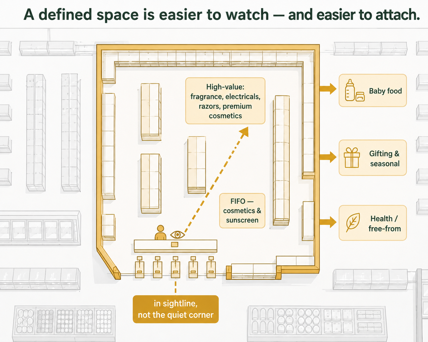
Bounding the department does two jobs at once — it puts the handful of high-value lines in a staff sightline instead of the quietest corner, and it lets the department be placed against the three baskets it attaches to: baby food, gifting, and health and free-from.
Health and beauty is never a destination on its own in a supermarket — it earns by attaching to trips the shopper is already making. Three adjacencies do most of the work.
Baby care next to the baby-food trip, so the nappies and the wipes join the basket that was already coming. Beauty next to gifting and the seasonal lines, because fragrance and gift sets are occasion purchases and an occasion shopper is buying a present, not a product. And wellness next to health, pharmacy where there is one, and the free-from food lines, because the shopper choosing a supplement and the shopper reading a food label are the same person on the same mission.
Merchandised in isolation in the middle of the ambient floor, health and beauty attaches to nothing and lives or dies on its own footfall. Placed against those three baskets, it lifts trips it is not even part of.
When a room is the wrong answer
Ambition has to match what the store can actually run and fund. In a small or value-led store, the honest answer is core toiletries, value cosmetics and the baby and feminine staples, navigated clearly and lit properly — and nothing else. No beauty feature, no fragrance wall, no advice point. Building a premium beauty space into a catchment that will not trade up produces a handsome, empty corner and ties up floor that another department would have turned.
The test is straightforward: does the catchment support the trade-up, and can the store fund the labour any served or advised element assumes? If the answer to either is no, take the two moves that cost almost nothing — need-state navigation and colour-true light on whatever cosmetics are carried — and leave the rest until the trading proves it.
The takeaway
Take one thing to your next layout: health and beauty is a browse-and-consider category, so give it a defined, well-lit space to be browsed in, navigate it by need rather than by supplier, and keep the four or five high-value lines in a staff sightline. The aisle treatment quietly caps the department at its restock trade, wastes the margin sitting in the trade-up range, and leaves the theft magnets where nobody is looking. A bounded space, colour-true light on the cosmetics, need-state signage and the right three adjacencies turn a shelf people pass into a department people shop — and it is decided on a plan, long before anything is bought.
Working out whether health and beauty should be an aisle or a space in your store? A layout review will tell you whether the department is placed to attach to the baskets it belongs to, whether it is navigable by need or only by memory, whether the cosmetics are lit well enough to sell, and whether the high-value lines sit in anyone's sightline — before anything is drawn for approval. Start with a layout review or get in touch .
FAQ
1. Should health and beauty be an aisle or its own space in a supermarket?
In most stores it earns more as a defined space than as another aisle, because health and beauty is a browse-and-consider category. Two very different shoppers use it: one restocking a known toiletry, who is finished in under a minute, and one choosing a foundation, a serum, a supplement or a fragrance, who is slow on purpose. The margin sits with the second shopper, because trading up from an everyday product to a premium one is a decision made standing still — and an aisle with trolleys coming through it gives nobody anywhere to stand. A defined space buys that pause. The exception is a small or value-led store, where the honest answer is core toiletries and staples navigated clearly and lit properly, with no beauty feature at all.
2. What does giving health and beauty "a room" actually mean in a supermarket?
It does not mean walls, and it does not mean a beauty hall. It means the shopper can tell they have arrived somewhere different from the aisle they were just in. That reads through a handful of inexpensive signals: a clear edge or entry rather than the department bleeding into groceries, runs turned or set back so the space has some depth instead of being a straight through-route, a bulkhead or ceiling change or simply a different light over the top of it, and its own signage tone. In a small store that might be one bounded end bay with better light; in a large one, a set-apart area with a feature and an advice point. The point is legibility, not capital expenditure.
3. How should a supermarket health and beauty department be laid out?
Navigate it by need-state rather than by supplier: skin, hair, oral, baby, feminine and wellness. That is how the shopper thinks — "something for dry skin", not a brand name. Health and beauty is the most confusing range on the floor, carrying the most brands, the most near-identical packaging and the widest price spread, so arranging it the way it arrives from suppliers means only a shopper who already knows what they want can find it, which cuts the department down to its restock trade. Inside each need-state, block good, better and best so trading up is a step across rather than a hunt. Sign the need-states so they can be read from the entry to the space, and get the price and unit ticket right before adding any cleverer signage layer.
4. What lighting does a supermarket cosmetics and beauty department need?
Cosmetics need high colour-rendering light — a CRI of 90 or above — so a colour reads on the shelf the way it will read on the shopper's face in daylight. Under general warehouse-grade lighting, foundations, lipsticks and hair colours read wrong, and the shopper either buys the wrong shade and returns it or senses something is off and does not buy at all. Neither outcome shows up in a report as a lighting problem; it shows up as a category that will not grow. The rest of the department needs clean, even, navigable light, because much of this range carries small print and a shopper who has to squint at an ingredient list puts it back. Where there is a beauty feature, light it to flatter — it lifts the perceived quality of everything around it.
5. How do you reduce theft in a supermarket health and beauty department?
Health and beauty has an unusual shrink profile: the losses concentrate in a very small number of lines — fragrance, small electricals, razors and premium cosmetics — which are small, valuable and easy to pocket. A defined department is far easier to keep in one staff sightline than two long runs in the middle of the floor, so put those lines where the department is naturally overlooked, from a service point, a manager position or a till line, rather than in the deepest, quietest corner. Where the store role justifies it, use secured or staff-assist display for those specific lines and leave the rest of the department open, because locking up the whole category kills the browsing the department depends on. Cover receiving as well, since high-value stock is most exposed between the delivery door and the shelf.
6. Where should health and beauty sit in a supermarket layout?
Place it to attach to trips the shopper is already making, because health and beauty is rarely a destination on its own in a supermarket. Three adjacencies do most of the work. Baby care next to the baby-food trip, so nappies and wipes join a basket that was already coming. Beauty next to gifting and the seasonal lines, because fragrance and gift sets are occasion purchases and an occasion shopper is buying a present rather than a product. And wellness next to health, pharmacy where there is one, and the free-from food lines, because the shopper choosing a supplement and the shopper reading a food label are the same person on the same mission. Merchandised in isolation in the middle of the ambient floor, the department attaches to nothing.
7. How do you stop cosmetics and sunscreen dating out in a supermarket?
Date expiry is the second half of health and beauty shrink, after theft. Cosmetics and sunscreen expire, and sunscreen is seasonal, so it dates out quietly if nothing rotates it. Run first-in-first-out on every dated line, so the oldest stock is always in front. Keep the storeroom close enough to the department that refilling properly is quicker than dumping new stock on top of old, because a long walk is what turns good rotation intentions into a back-of-shelf write-off. And size the range to what the store actually turns over — a range wider than the turnover justifies is a slow-motion write-off, however good it looks on a planogram. Judge the department on margin after shrink, not on gross margin, or the rotation problem stays invisible.
