How to Lay Out a Store to Drive Sales: Plan the Route, Not the Rooms
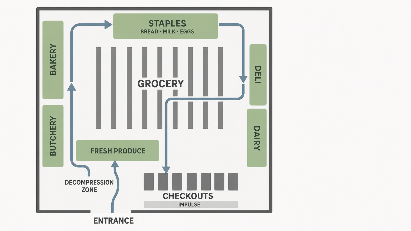
The layout is the route: fresh first, staples deep, ambient in the middle — so the walk to what the shopper came for passes as much sellable space as possible.
A bigger basket is almost never built inside one department. It is built between departments — on the route the shopper walks and the item you put in front of them next. So the fastest way to lift sales in an existing store is usually not a better butchery or a smarter produce wall. It is a better route, and the handful of adjacencies that turn a single-item trip into a fuller basket.
Most stores are planned the other way round. Each department is designed and signed off on its own, and the space between them is left to whatever fits. You end up with departments that are individually good and a store that still sells singles, because the walk sends the shopper straight to what they came for and straight out.
Here is how to lay the store out as one connected route instead.
Start with the walk, not the departments
Before you place a single fixture, draw the route the shopper takes from the door to the till, with one-way arrows. That spine is the layout. Everything else hangs off it.
The route does three jobs in order. It sets the first impression, it carries the shopper past as much sellable space as possible on the way to what they came for, and it hands them the second and third item along the way. A store planned as a set of rooms optimises each room. A store planned as a route optimises the basket.
Lead the customer in through a decompression zone — a clean, branded, uncluttered few metres with clear wayfinding — before anything is for sale. Shoppers walking in from a car park or a mall need a beat to slow down and switch into shopping mode; sell to them too early and they walk past it. Then feed them into the first selling department, which for almost every food store is fresh produce.
Fresh first, staples deep
Two placement rules do most of the work, and they pull in opposite directions on purpose.
Fresh goes first. Produce at the front sets the freshness impression for the whole store — colour, abundance, smell — and it starts the basket while the trolley is empty and the shopper is receptive. It is the store's freshness signal, and it earns the front-of-store position that every category wants.
Destination staples go deep. Bread, milk and eggs are what most shoppers came for, and that is exactly why they belong at the back and along the far perimeter, not by the door. Put the milk where the shopper has to walk past produce, the promotions and half the grocery aisles to reach it, and every one of those metres is a selling opportunity on a trip that would otherwise have been in and out. This is the oldest rule in supermarket planning and it still holds because it works: the things people cannot leave without are the things you use to pull them through the store.
The perimeter carries the fresh and chilled departments — produce, bakery, butchery, deli, dairy — as a loop, because they need services and because they draw the shopper around the outside of the box. The centre is the ambient grocery grid the perimeter wraps around, and its aisles are the main navigation routes. Fresh on the edge, staples deep, ambient in the middle: that is the skeleton of almost every food store that sells well.
The route depends on the shopping mission
One caution before you commit to the long lap: fresh-first and staples-deep is built for the big shop — the weekly or monthly main outing, where the shopper has a trolley and time, and the long route earns its keep by building the basket. It is the right logic for a full-line supermarket. It is the wrong logic for the other missions.
A grab-and-go shopper wants in and out in ninety seconds. Make them walk to the back of the store for a cold drink and a sandwich and they will buy it somewhere else next time. A weekly top-up shopper wants the twenty lines they have run out of, fast, not a lap of the whole floor. Force every shopper around a route built for the main shop and you lose the quick missions that a well-planned store could have kept.
So match the spine to the mission the store is actually built for:
Main / monthly shop: the full lap — fresh first, staples deep, the long route that builds the basket. Most full-line supermarkets are planned around this.
Weekly top-up: keep the high-frequency staples — bread, milk, eggs — reachable without the whole lap, and put a strong value/KVI cluster on the main route so the quick trip still picks up a deal or two.
Grab-and-go / convenience: food-to-go, chilled singles and coffee right at the front, by the entrance and the till, as a compact self-contained cluster. The compact-format approach is to sequence chilled fresh and food-to-go before the dry grocery, so the fast mission is served in seconds and the browse is optional, not forced.
Most stores serve more than one mission. The layout job is to know which mission pays the rent, plan the spine for that one, then serve the others with a shortcut — a top-up cluster near the front, a grab-and-go bay at the entrance — rather than dragging everyone around a lap built for someone else. Adjacency still does the basket-building within whichever route the shopper is on.
Plan the connections: eight adjacencies that build the basket
Sequence gets the shopper moving. Adjacency is what makes them add the next item. These are the connections worth planning deliberately, because each one turns a single purchase into two or three:
Produce next to herbs, salad and dressings. The salad shopper is one reach away from the dressing and the fresh herbs. Split them across the store and you sell the lettuce alone.
Meat next to marinades, spices and sauces. Someone buying chops is buying a braai or a dinner. Put the marinades, rubs and braai spices where the hand already is.
Bread and dairy on the route shoppers already walk. These are staples, so they sit deep — but position them on the main perimeter route, not tucked in a dead corner, so the walk to them stays a selling walk.
Deli next to wine and entertaining lines. The cheese-and-wine basket is a real basket. The shopper assembling a platter should meet the wine and the crackers without hunting for them.
Prepared foods next to drinks and grab-and-go. The lunch mission is a meal plus a cold drink. Put the fridge of singles beside the hot food and the ready meals, not an aisle away.
Flowers and gifting near the entrance and the front-end. High-impulse, high-margin, occasion-led. They catch the eye on the way in and the add-on on the way out.
Impulse at the checkout, matched to the mission. The last metre is still selling. Match the impulse lines to the store's shopper — a snack-and-drink mix for a top-up store, a wider add-on for a main-shop store.
Plan the connections, not only the departments. The adjacencies above are the layout doing the cross-selling for you. None of them cost anything extra to get right on the drawing — they only cost money once a department is built in the wrong place.
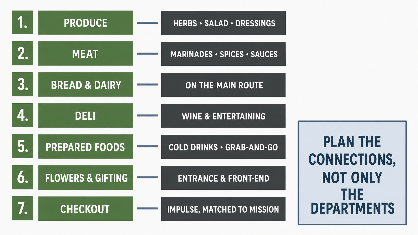
Eight adjacencies do the cross-selling for you — each one turns a single purchase into two or three, and each is free to get right on the drawing.
Cross-merchandising runs on top of this. Ends and mission cues carry the meal solution across aisles — pasta to sauce to parmesan, breakfast to coffee, braai staples to charcoal — so the centre-store sells meals, not single tins.
Show the store is sharp on price, from the door
The moment a shopper walks in, the store should read as sharp on price — that first impression carries the whole trip. Two tools do it, and both are layout decisions, not signage afterthoughts.
Position the promotional gondola ends so the strongest deals are visible from the entrance. It is not always possible, but it is always the intent, because a hot deal in the entrance sightline is what sets price perception. And put a Wall of Value — a run of modules carrying the store's top twenty or so lines on permanent, genuinely cheap value display — on the high-traffic main route, where the most feet pass it. Get those two right and the shopper trusts the store on price before they have picked up a single item.
Set aisle width to fixture height, not to the tape measure
A route only sells if the shopper is comfortable walking it, and the number that decides that is aisle width. Set it wrong and the best adjacency in the world sits in an aisle people avoid.
The rule is that the aisle in front of merchandise is the greater of three drivers: the legal fire and accessibility floor (around 1 200 mm — confirm against the local code, and treat it as a floor, never a target), the trolley clearance for your format (a basket-only store needs about 1 000 mm, a trolley store about 1 400 mm where trolleys pass), and — the one most often missed — comfort against fixture height. A low island around 1.0 m high reads fine at about 1 200 mm. A mid gondola at 1.5 m wants about 1 500 mm. A full-height 2.1 m gondola run needs at least 1 800 mm, or the aisle feels like a canyon and shoppers avoid it. Take the widest of the three, per zone, and record it.
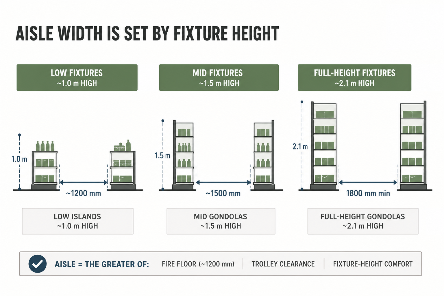
Aisle width is the greater of the fire floor, the trolley clearance and fixture-height comfort — tall gondolas need wider aisles or the shopper avoids them.
Tall fixtures buy stock capacity at the cost of sightlines and comfort, which is why 1 800 mm gondolas are the general supermarket standard rather than the tallest available. And in South Africa and across the SADC region, gondola runs are built on the 914 mm (three-foot) bay — the practical unit your whole grid dimensions to. Wide aisles under tall fixtures is not wasted floor; it is the difference between an aisle that sells and one that shoppers skip.
Lock the route and the adjacencies before you move anything
Moving a department is expensive. Services, drainage, cold-chain, downtime — a fresh department in the wrong place is a five-figure mistake to correct on site and close to free to get right on the drawing.
So resolve the whole thing before any working drawing or building work starts. Agree what each department has to do. Agree how the shopper moves between them. Agree which adjacencies are doing the basket-building work, and where services are needed to support the cross-merchandising. Do that first and the working drawings stay clean and the site stays quiet. Skip it and you pay carpenters and refrigeration contractors to fix a decision that a pencil could have fixed for nothing.
The takeaway
Before you brief a drawing or move a fixture, decide which shopping mission pays the rent — main shop, weekly top-up or grab-and-go — because that sets the spine. Then map the store as one route and write down two lists. The first is the sequence: decompression zone, fresh at the front, staples deep, ambient grid in the middle, impulse at the till. The second is the adjacencies that must do the basket-building — produce to dressings, meat to marinades, deli to wine, prepared foods to cold drinks, flowers and gifting at the front — with services planned where the cross-sell needs them. Set every aisle to the greater of the fire floor, the trolley clearance and the fixture-height comfort, and lock the whole plan before anyone builds. Do that and the store sells the second and third item on the walk you already own, instead of ringing up singles in a set of individually tidy rooms.
A bigger basket is built between departments. Plan the connections, not only the rooms.
Related reading
Why produce belongs at the front and how it starts the basket — Fresh Produce Should Start the Basket, Not Just Fill the Department.
The last metre of the route, sized and merchandised right — The Checkout Is the Last Metre of Selling.
Where the route and adjacencies get specified and status-controlled — Concept Design vs Working Drawings in Retail Projects.
Planning a new store or a refit?
A layout stage maps the route and locks the adjacencies before any drawing starts — so the basket is built on the walk, not left to chance. Start with a layout review with Grove Retail Design, or get in touch.
FAQ section (publish these as visible Q&A at the foot of the article)
Add these as visible Q&A at the foot of the article, then paste the matching FAQPage schema block (see schema file) so the schema matches the page word-for-word.
How do you lay out a supermarket to drive sales? Plan the store as one connected route, not a set of separate departments. Lead the shopper in through a decompression zone, put fresh produce first to set the freshness impression and start the basket, run the perimeter past the chilled staples, and push destination staples like bread and milk deep so the walk passes as much sellable space as possible. Then plan the adjacencies between departments — the connections that add the second and third item — and set the impulse lines at the checkout. The route and the adjacencies are what build the basket, not any single department.
Where should fresh departments and everyday staples go in a store layout? Fresh goes first and staples go deep. Produce at the front sets the freshness impression for the whole store and starts the basket while the trolley is empty. Bread, milk and eggs are what most shoppers came for, so they belong at the back and along the far perimeter — placing them deep pulls the shopper past produce, promotions and the grocery aisles on the way, turning an in-and-out trip into a selling walk. The perimeter carries the fresh and chilled loop, and the centre carries the ambient grocery grid the perimeter wraps around.
Does store layout change for grab-and-go, convenience and top-up shoppers? Yes. Fresh first and staples deep is built for the main weekly or monthly shop, where the long lap earns its keep by building the basket. It is the wrong logic for a grab-and-go, convenience or top-up mission, where the shopper wants in and out fast — force them to the back for a cold drink and a sandwich and they will buy it elsewhere next time. Match the spine to the mission the store is built for: the full lap for the main shop; high-frequency staples and a value cluster reachable without the whole lap for the top-up; and food-to-go, chilled singles and coffee at the front by the entrance and the till for grab-and-go. Most stores serve more than one mission, so plan the route for the one that pays the rent and serve the others with a shortcut.
What are the best department adjacencies for a bigger basket? The connections worth planning deliberately are: produce next to herbs, salad and dressings; meat next to marinades, spices and sauces; bread and dairy on the main route shoppers already walk; deli next to wine and entertaining lines; prepared foods next to cold drinks and grab-and-go; and flowers and gifting near the entrance and the front-end. Match the checkout impulse lines to the store's shopper mission. Each adjacency turns a single purchase into two or three, and none of them cost anything extra to get right on the drawing.
How wide should supermarket aisles be? Set each aisle to the greatest of three drivers: the fire and accessibility minimum (around 1 200 mm, confirmed against the local code and treated as a floor, not a target); the trolley clearance for your format (about 1 000 mm basket-only, about 1 400 mm where trolleys pass); and comfort against fixture height. Fixture height is the one most often missed — a 1.0 m island reads fine at about 1 200 mm, a 1.5 m gondola wants about 1 500 mm, and a full-height 2.1 m gondola run needs at least 1 800 mm or the aisle feels like a canyon and shoppers avoid it. Take the widest per zone and record it.
Why should you lock the layout and adjacencies before moving a department? Because moving a department is expensive — services, drainage, cold-chain and downtime — while getting the route and adjacencies right on the drawing costs almost nothing. Before any working drawing or building work starts, agree what each department must do, how the shopper moves between them, which adjacencies do the basket-building work, and where services are needed to support cross-merchandising. Resolving this first keeps the working drawings clean and avoids costly rework on site.
